
P. Tcherneva-ren Inequality Update: Who Gains When Income Grows?1
(i) Hazkundeak errenta desberdintasuna ekartzen du2
(1., 2., 3., 4. ,5. eta 6. irudiak ikusteko sakatu linkak)
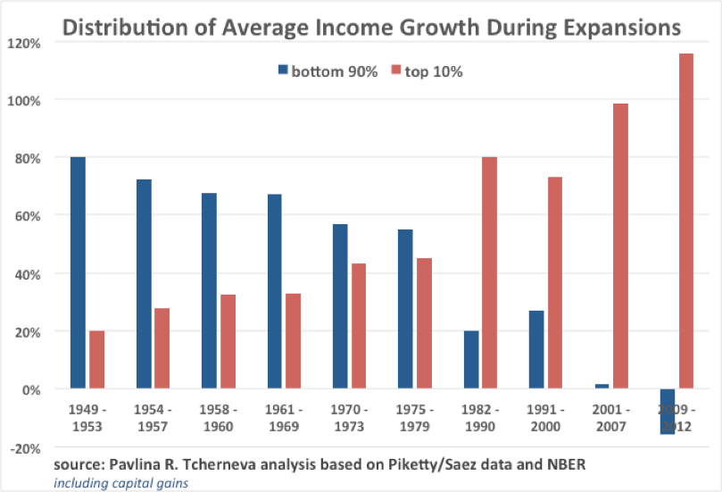
Figure 1: bottom 90% vs. top 10%, 1949-2012 expansions (incl. capital gains)
http://neweconomicperspectives.org/wp-content/uploads/2017/03/f1.png
(ii) 1. irudiaren ezaugarriak3
(iii) Datuen eguneraketa4
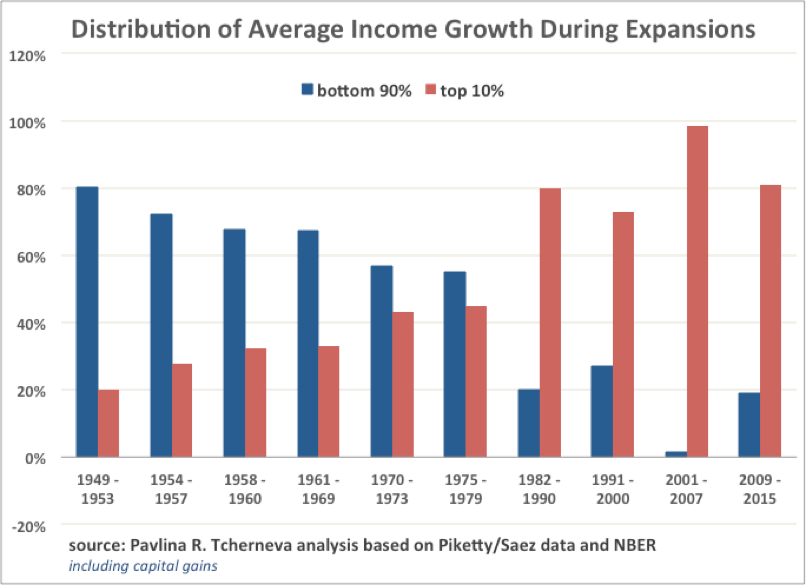
Figure 2: bottom 90% vs. top 10%, 1949-2015 expansions (incl. capital gains)
http://neweconomicperspectives.org/wp-content/uploads/2017/03/f2.png
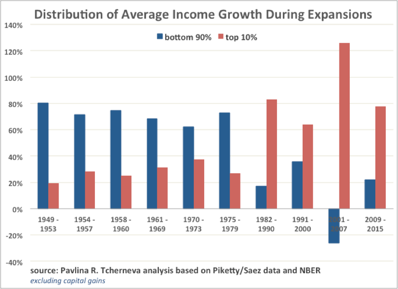
Figure 3: bottom 90% vs. top 10%, 1949-2015 expansions (excl. capital gains)
http://neweconomicperspectives.org/wp-content/uploads/2017/03/f3.png
(iv) Desberdintasuna 2014n eta 2015ean5
(v) Goiko %10a
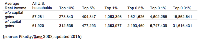
Since the top 10% of households is a rather heterogeneous group (see table 1), we consider the distribution of average income growth between the bottom 99% and top 1% (Figures 4 and 5).
Table 1
http://neweconomicperspectives.org/wp-content/uploads/2017/03/t1.png
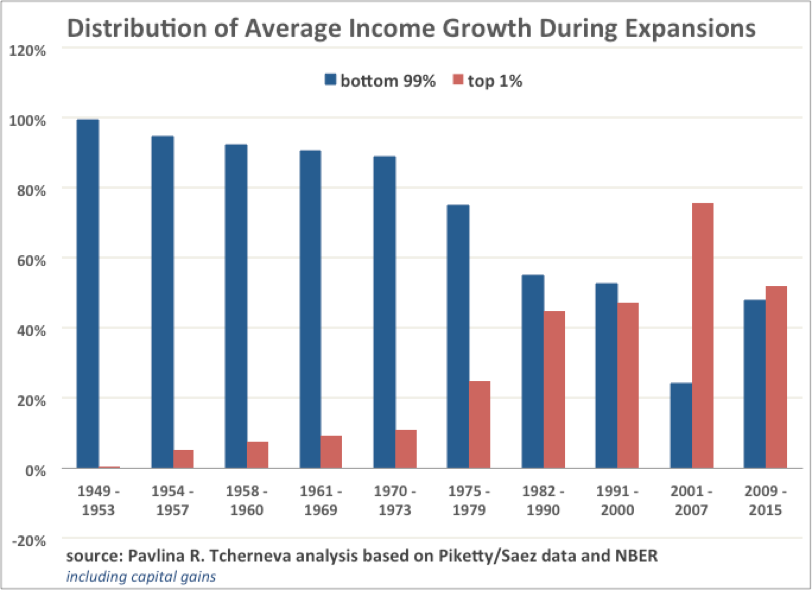
Figure 4: bottom 99% vs. top 1%, 1949-2015 expansions (incl. capital gains)
http://neweconomicperspectives.org/wp-content/uploads/2017/03/f4.png
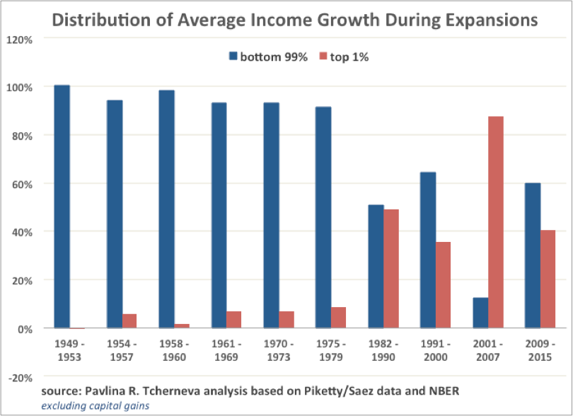
Figure 5: bottom 99% vs. top 1%, 1949-2015 expansions (excl. capital gains)
http://neweconomicperspectives.org/wp-content/uploads/2017/03/f5.png
(vi) 4. eta 5. irudien ezaugarriak6
(vii) 6. irudia7
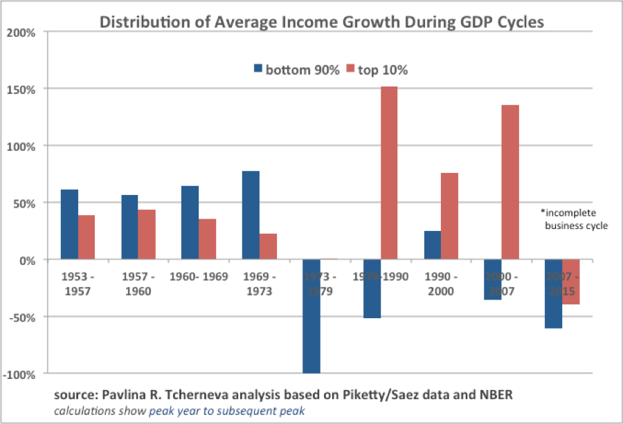
Figure 6: bottom 90% vs. top 10%, 1953-2015 business cycles, (incl. capital gains)
http://neweconomicperspectives.org/wp-content/uploads/2017/03/f6.png
Laburbilduz,
In sum, the growth pattern that emerged in the 80s and delivered increasing income inequality is alive and well. The rising tide no longer lifts most boats. Instead the majority of gains go to a very small segment of the population8.
2 Ingelesez: “Growth in the US increasingly brings income inequality. A striking deterioration in this trend has occurred since the 80s, when economic recoveries delivered the vast majority of income growth to the wealthiest US households. This note updates my original inequality chart (reproduced below) with the latest data. For earlier discussions, see e.g., here, here, and here.”
3 Ingelesez: “The chart illustrates that with every postwar expansion, as the economy grew, the bottom 90% of households received a smaller and smaller share of that growth. Even though their share was falling, the majority of families still captured the majority of the income growth until the 70s. Starting in the 80s, the trend reverses sharply: as the economy recovers from recessions, the lion’s share of income growth goes to the wealthiest 10% of families. Notably, the entire 2001-2007 recovery produced almost no income growth for the bottom 90% of households and, in the first years of recovery since the 2008 Great Financial Crisis, their incomes kept falling during the expansion, delivering all benefits from growth to the wealthiest 10%. A similar trend is observed when one considers the bottom 99% and top 1% percent of households (for details, as well as complete business cycle data, see here).”
4 Ingelesez: “The following figures update this analysis with the latest data (up to 2015) by looking at the distribution of average income growth (with and without capital gains) between the bottom 90% and top 10% of households, and between the bottom 99% and top 1% of households.[1]
[1] The analysis is based on Piketty and Saez data (2003, updated 2016), which report real average market income before taxes and transfers. Market income includes wages and salaries, entrepreneurial income, dividends, interest income and capital gains.
We find that little has changed when considering the distribution of average income growth between the bottom 90% and top 10% of families, with or without capital gains (figures 2 and 3, respectively).”
5 Ingelesez: “One difference is that average real income for the bottom 90% of households is no longer shrinking. In 2014 and 2015 it finally began to recover. Nevertheless, these families still capture a historically small proportion of that growth—only between 18%-22%. The growing economy continues to deliver most benefits to the wealthiest families.”
6 Ingelesez: “Figures 4 and 5 show that incomes of the bottom 99% (with or without capital gains) have recovered more robustly than those of the bottom 90% (Figures 2 and 3), meaning that the improvements are primarily concentrated in the next richest 9% of families. Their share of income growth is either 30% or 38%, depending on whether or not one includes capital gains, respectively.”
7 Ingelesez. “Finally, Figure 6 shows how income growth has been distributed over the different business cycles (peak to peak, i.e., including both contractions and expansions). The data for the latest cycle is incomplete, as we are still in it. The graph indicates that in the current cycle, incomes for all groups are still lower than their previous peak in 2007, however the loss is disproportionately borne by the bottom 90% of households.”


